Kabata: Identity
Smart strength, given a system to stand on
Kabata began with an idea for a smarter dumbbell.
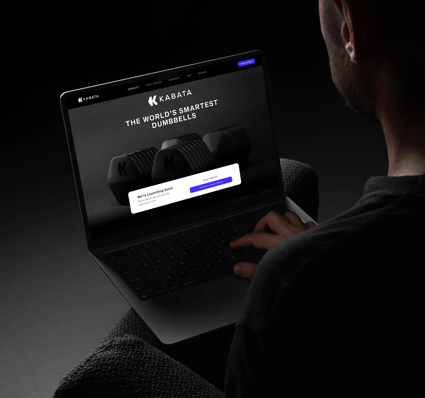
Founders Kareem Aly and Brian Lovera were developing an AI-powered free weight, but at the earliest stage, there was no finished product to show. The brand needed to make the idea tangible enough for people to understand what they were building and credible enough to enter conversations with investors and partners.
That meant creating more than a logo. The identity needed to establish the foundation for a product that would eventually live across hardware, software and fitness culture.
Familiar enough to understand. Different enough to own.
The dumbbell became the starting point.
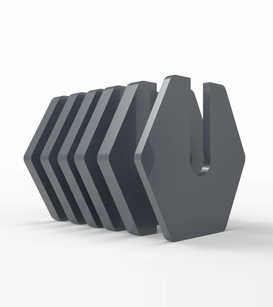
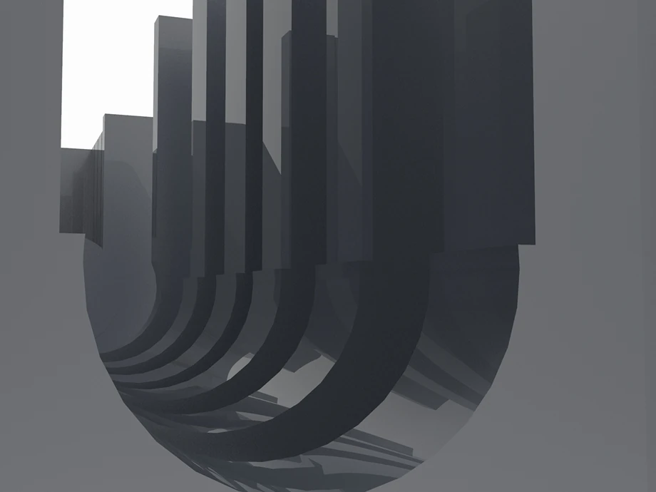
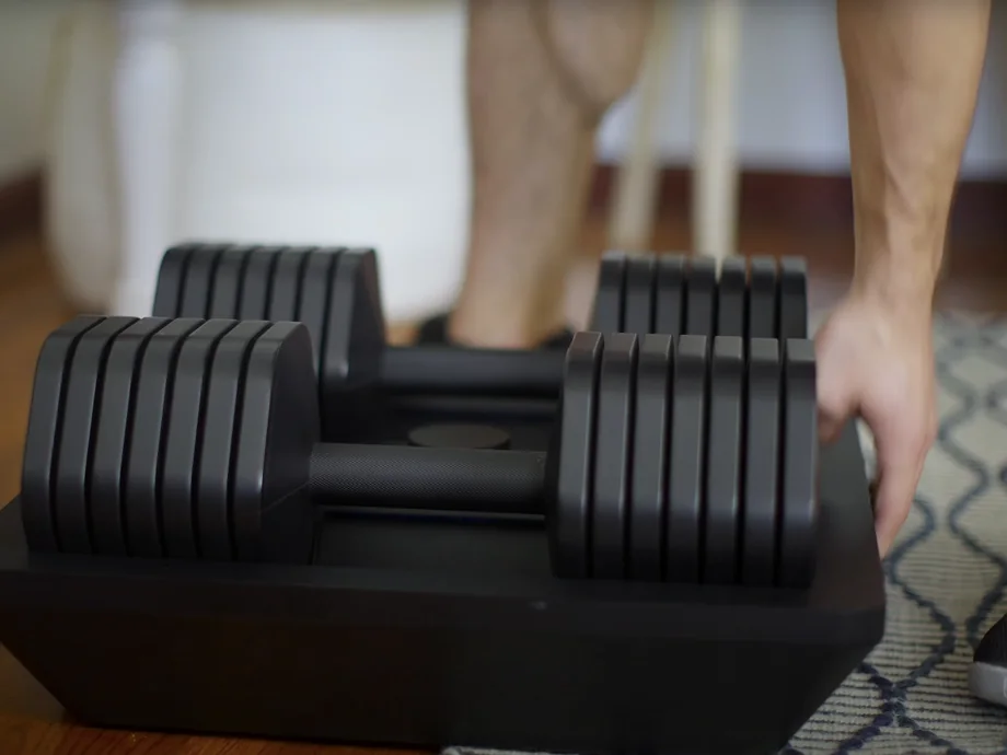
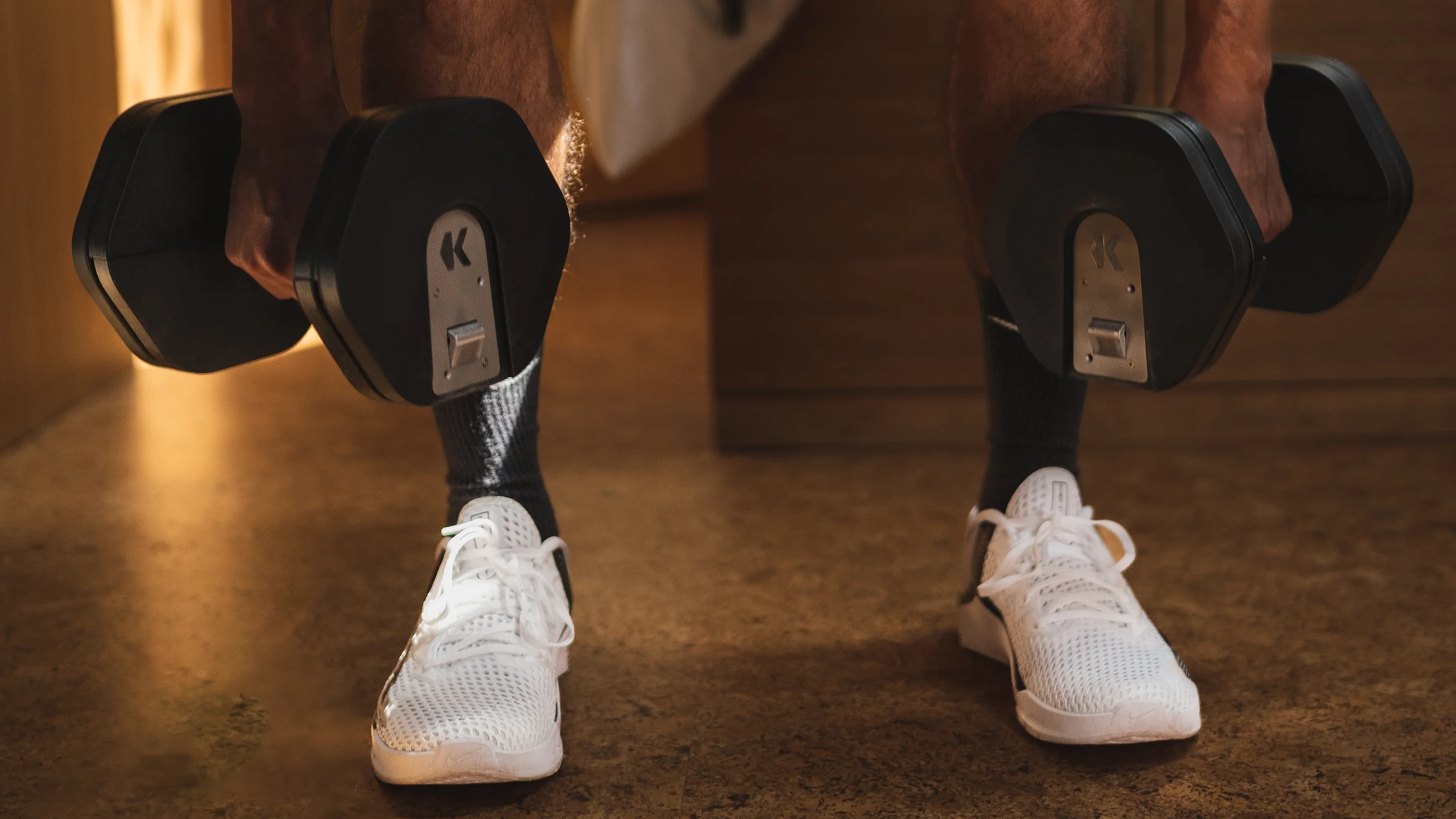
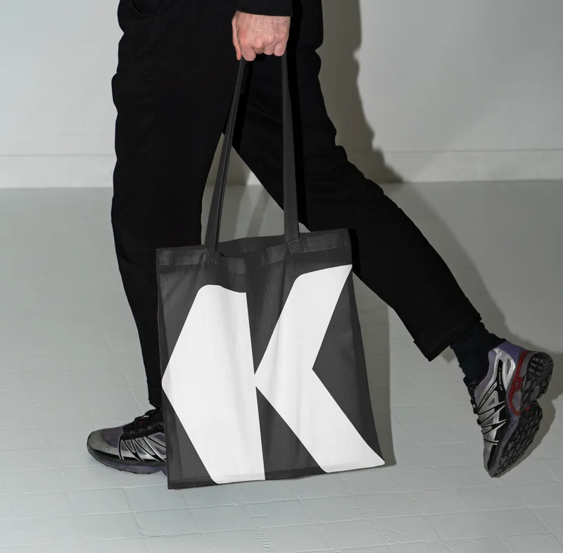
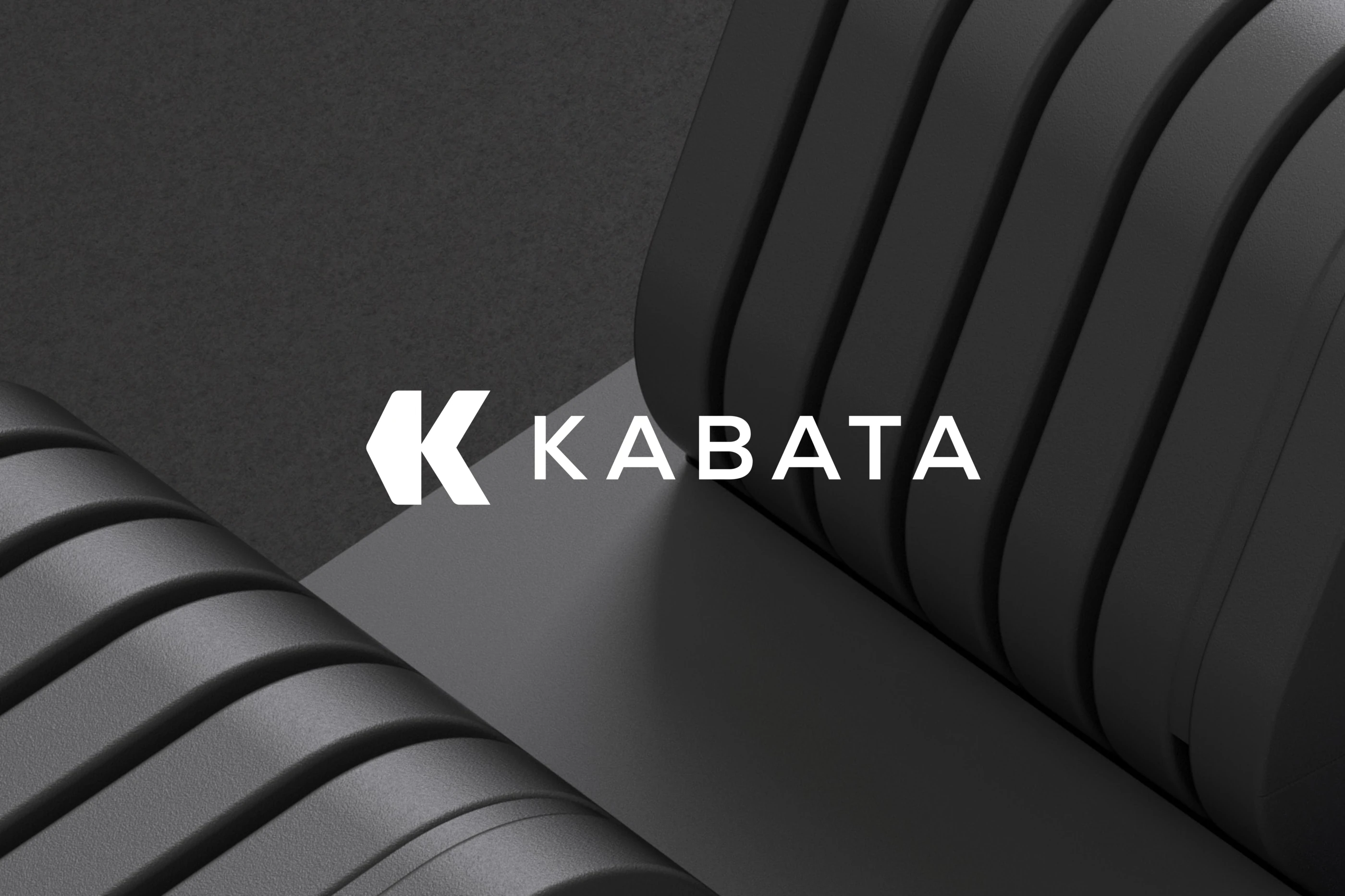
Traditional hexagonal free weights have an immediately recognisable shape. We used that geometry to construct the K, giving Kabata a mark connected directly to the category it wanted to reinvent.
The name added another layer to the story. In Japanese, Kabata refers to a system of connected reservoirs through which spring water flows between homes. At the same time, in Tagalog it can mean a childhood friend, an unexpected connection to Kareem and Brian, who first met as children.
The identity brought those ideas together around familiarity, connection and progression.
From a hexagon to a system.
The geometry behind the mark became more than a logo.
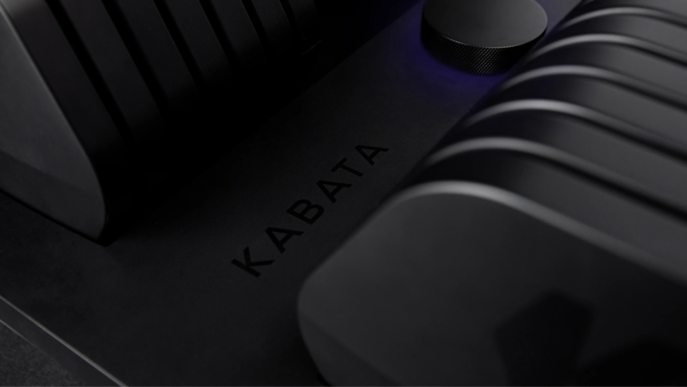
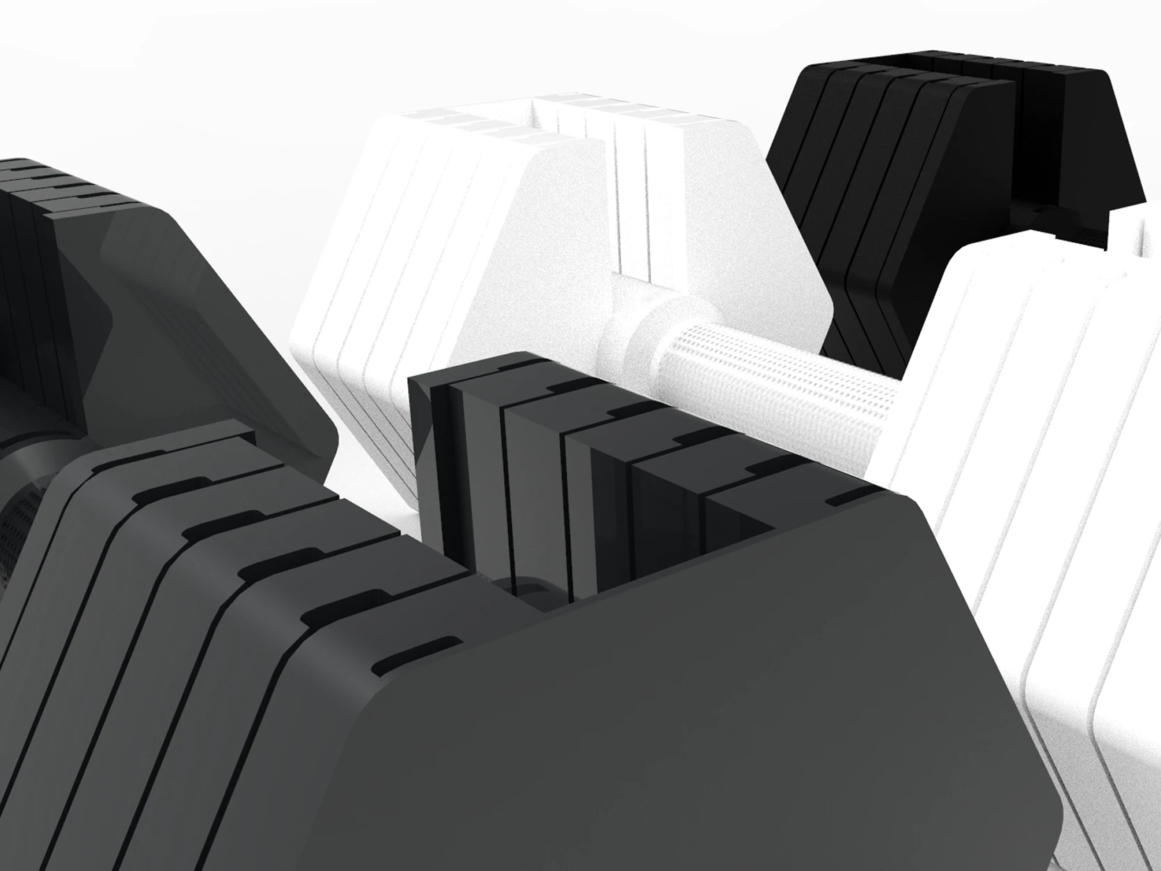
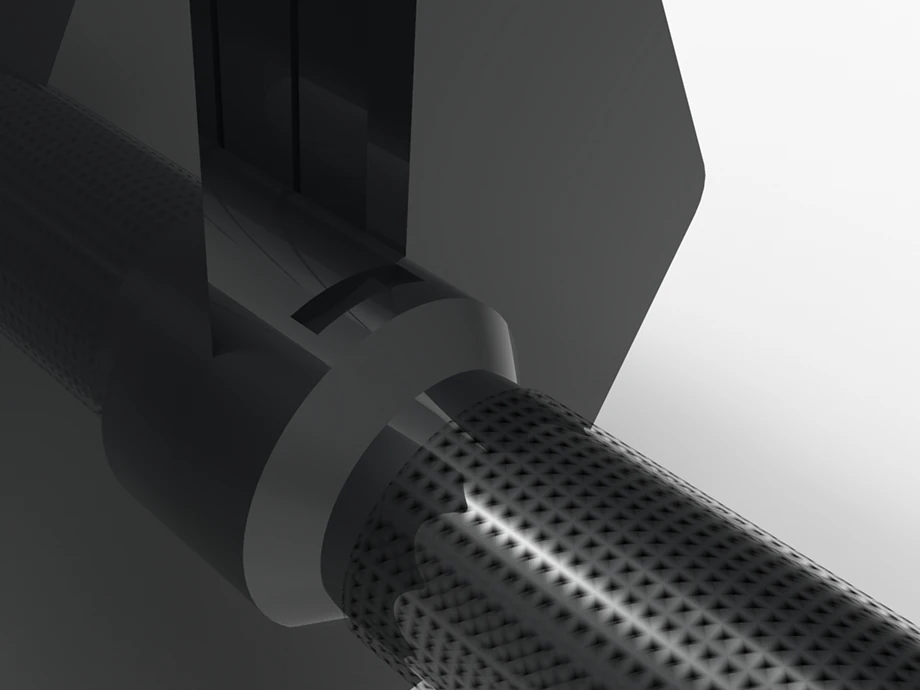
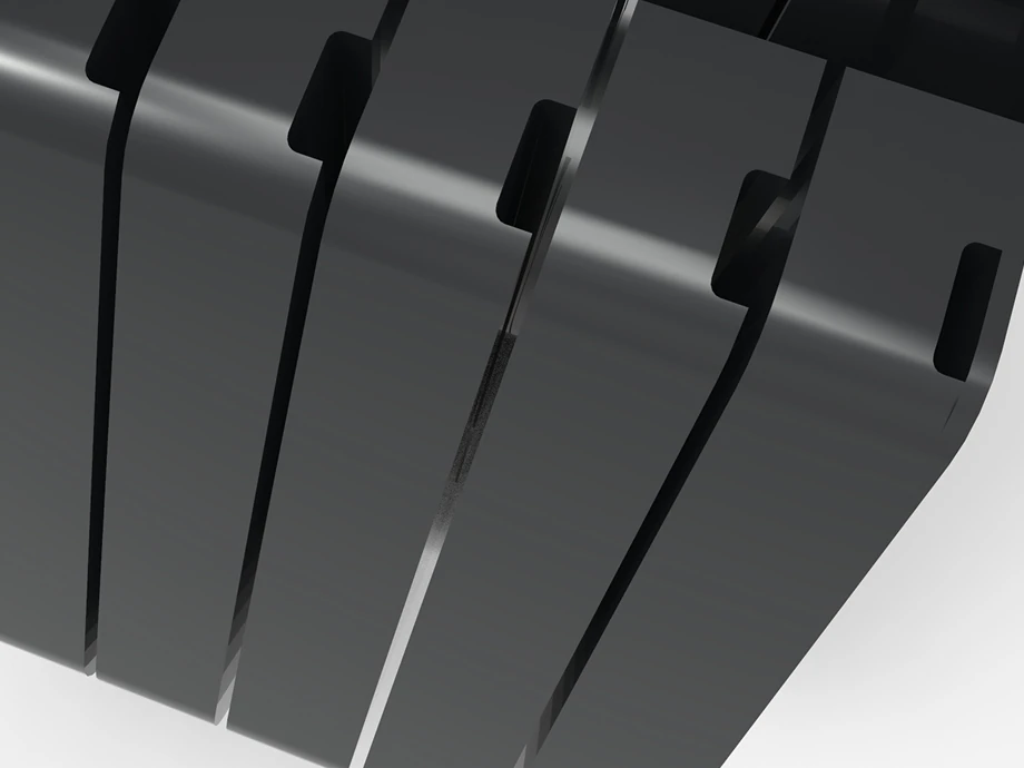
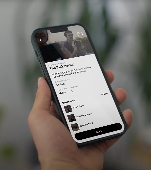
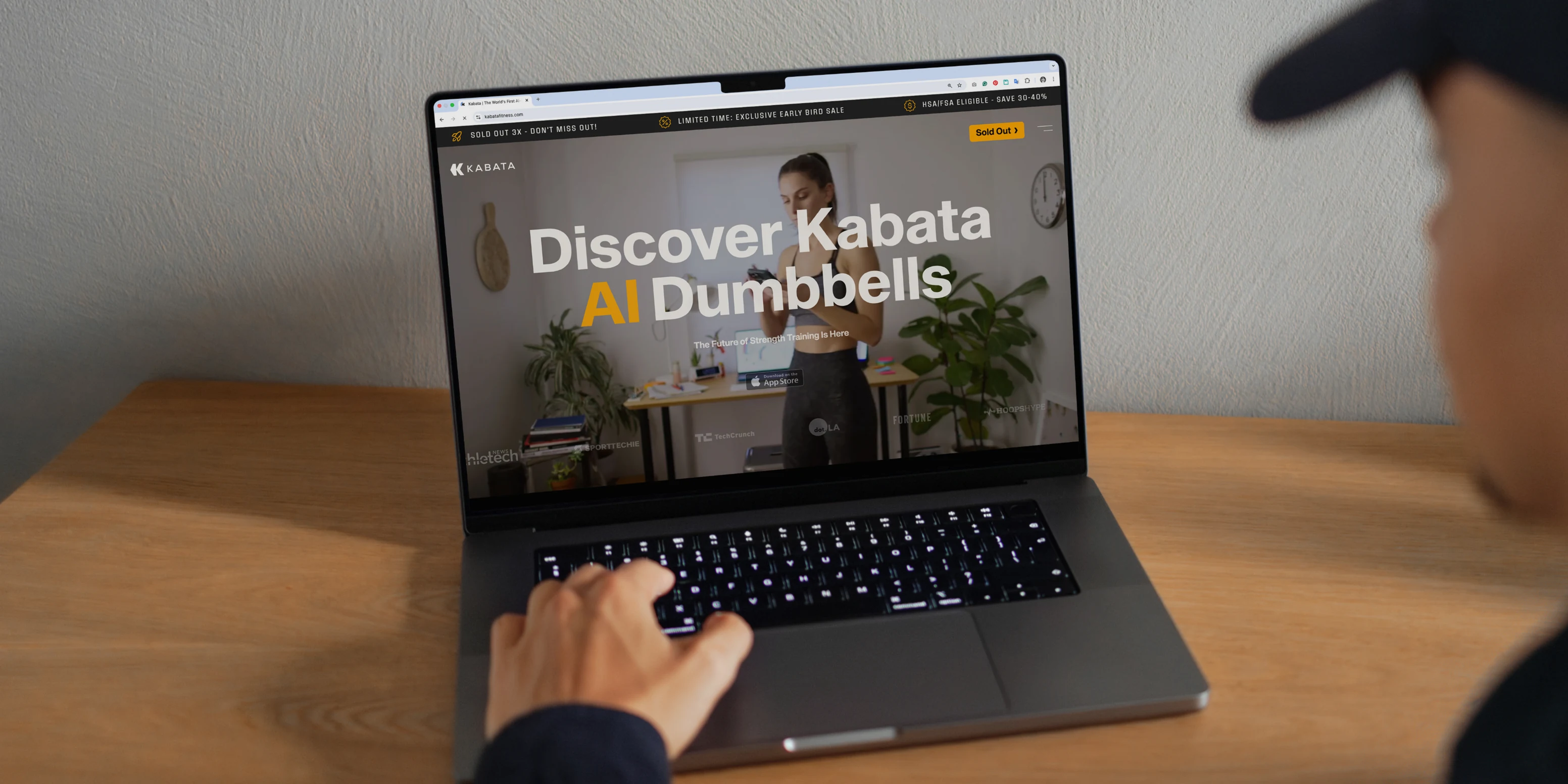
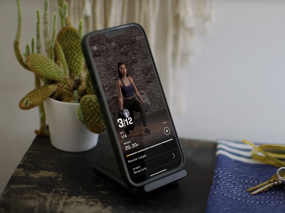
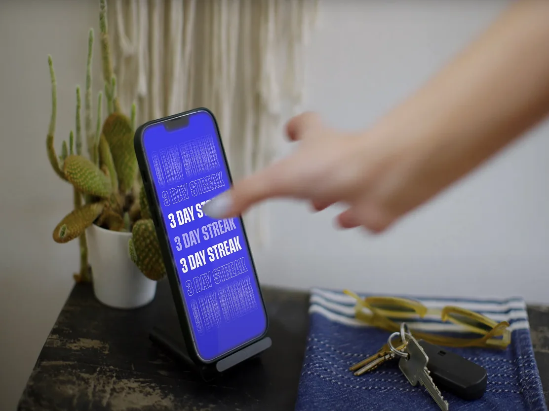
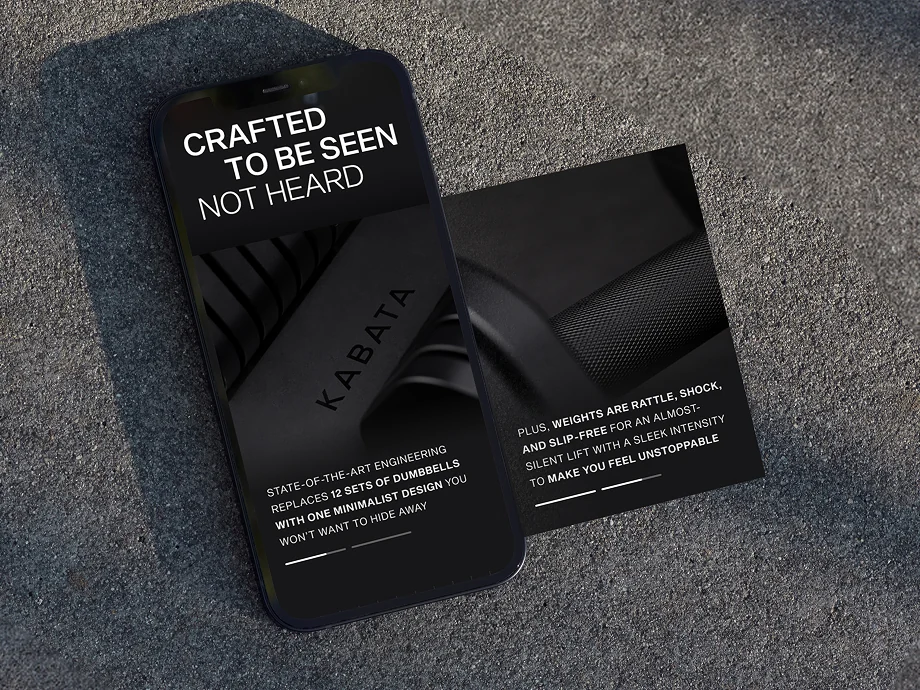
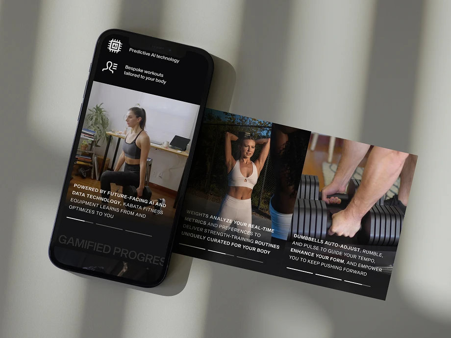
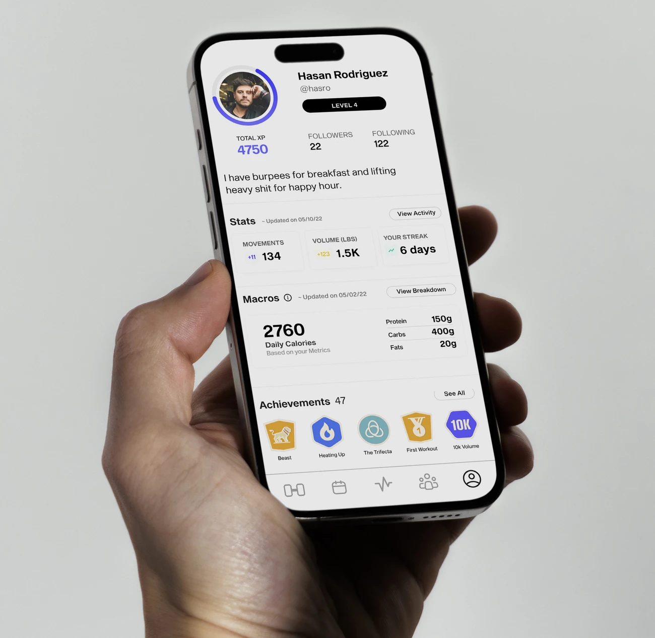
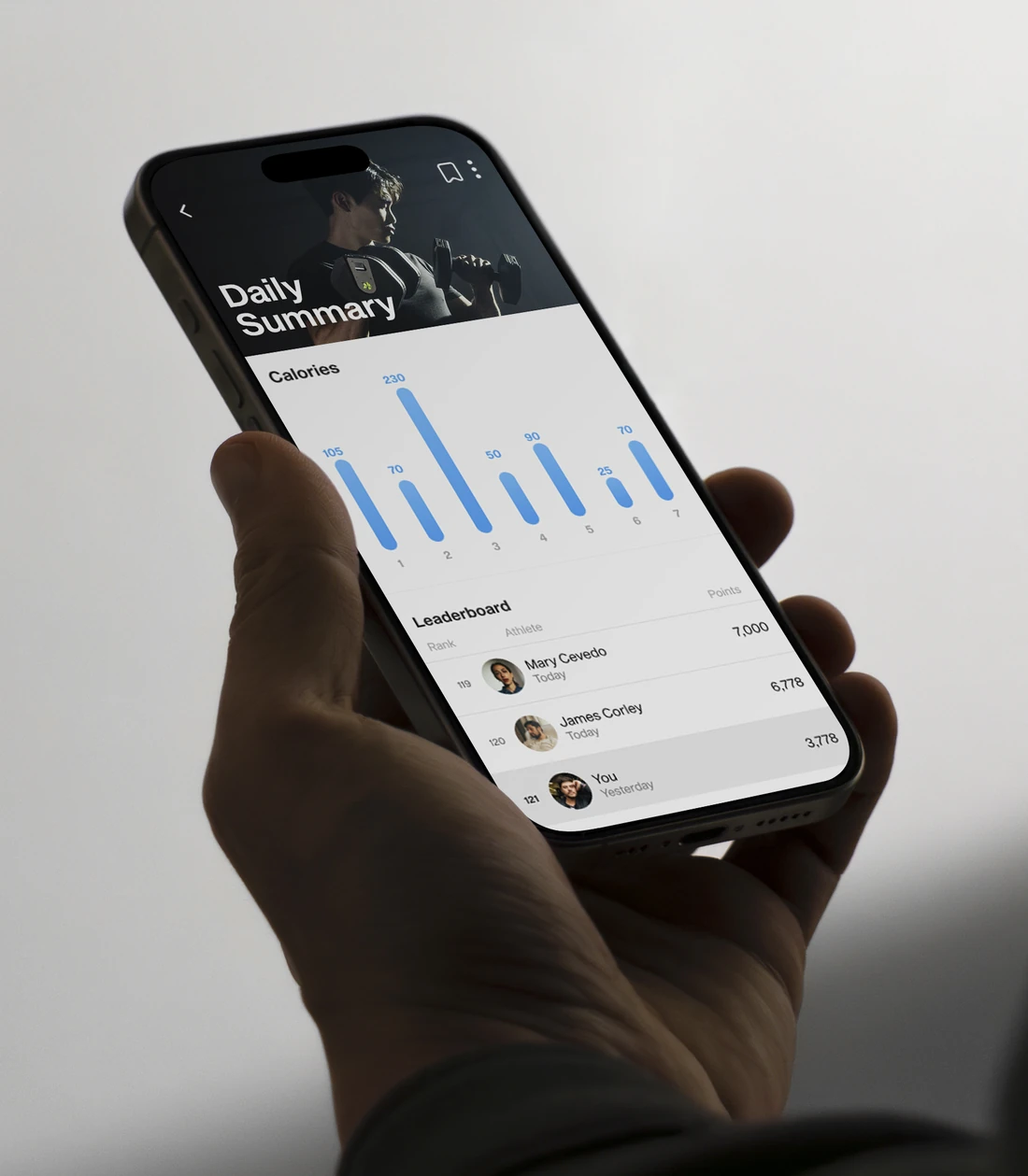
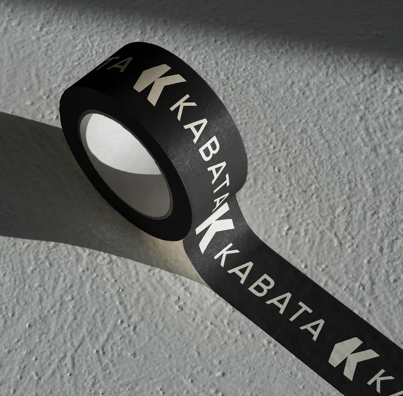
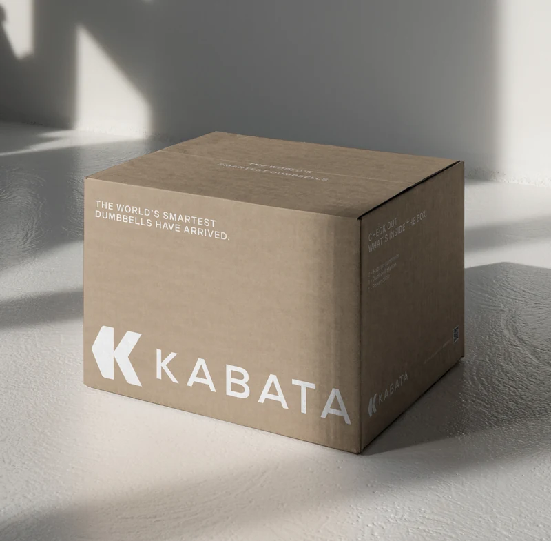
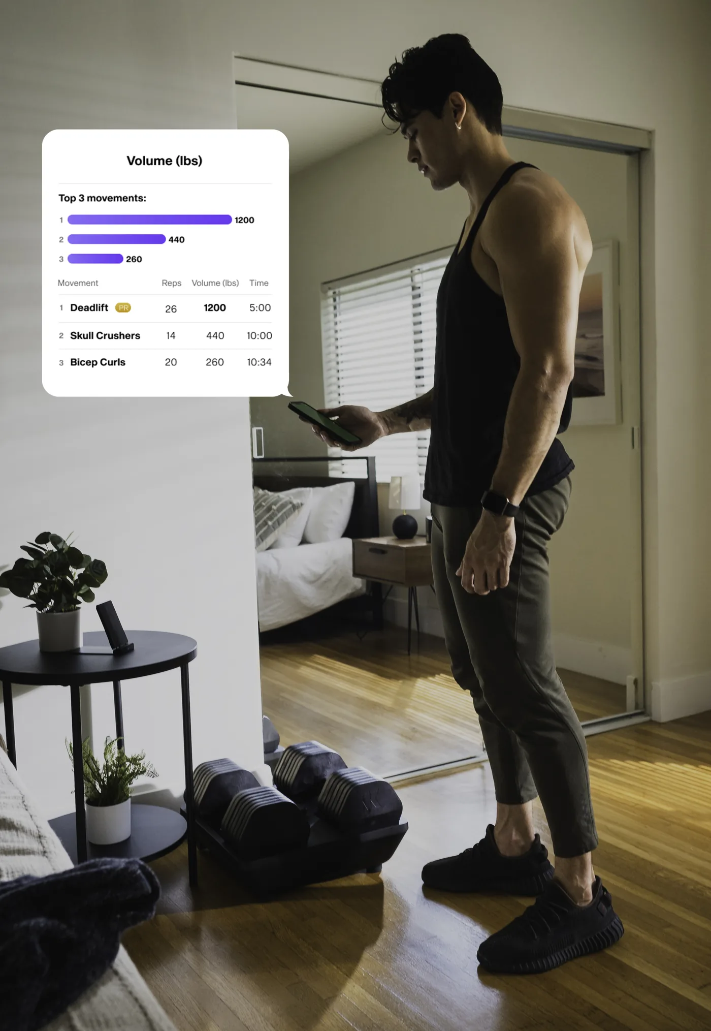
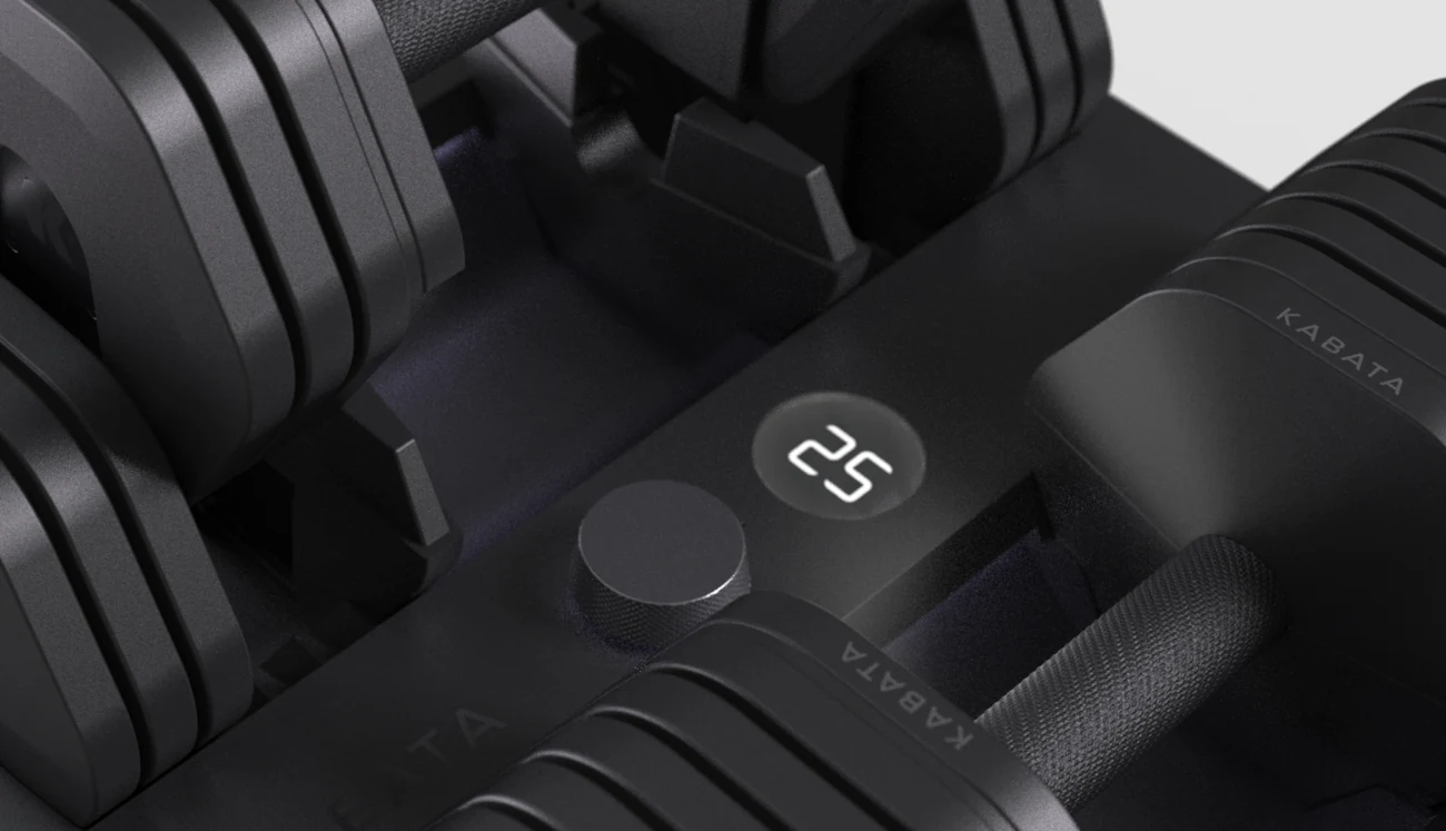
It informed the physical language of the dumbbells, the typography, packaging, digital interfaces and the visual structure around the product. A varsity-influenced typographic language connected the brand to traditional strength culture, while a cleaner digital system gave it the precision expected from a technology product.
The result was an identity that could sit naturally on a weight, inside an app or across a digital experience without becoming a different brand each time.
Giving an early idea something people could see.
The identity gave Kabata a visual foundation while the physical product continued to develop.
Kabata went on to secure an initial $2 million angel round, allowing the team to continue engineering and prototyping the smart dumbbell.
As the product evolved, the same foundational geometry continued across the hardware, app, and broader brand, turning an early fundraising identity into the basis of the product people would eventually use.