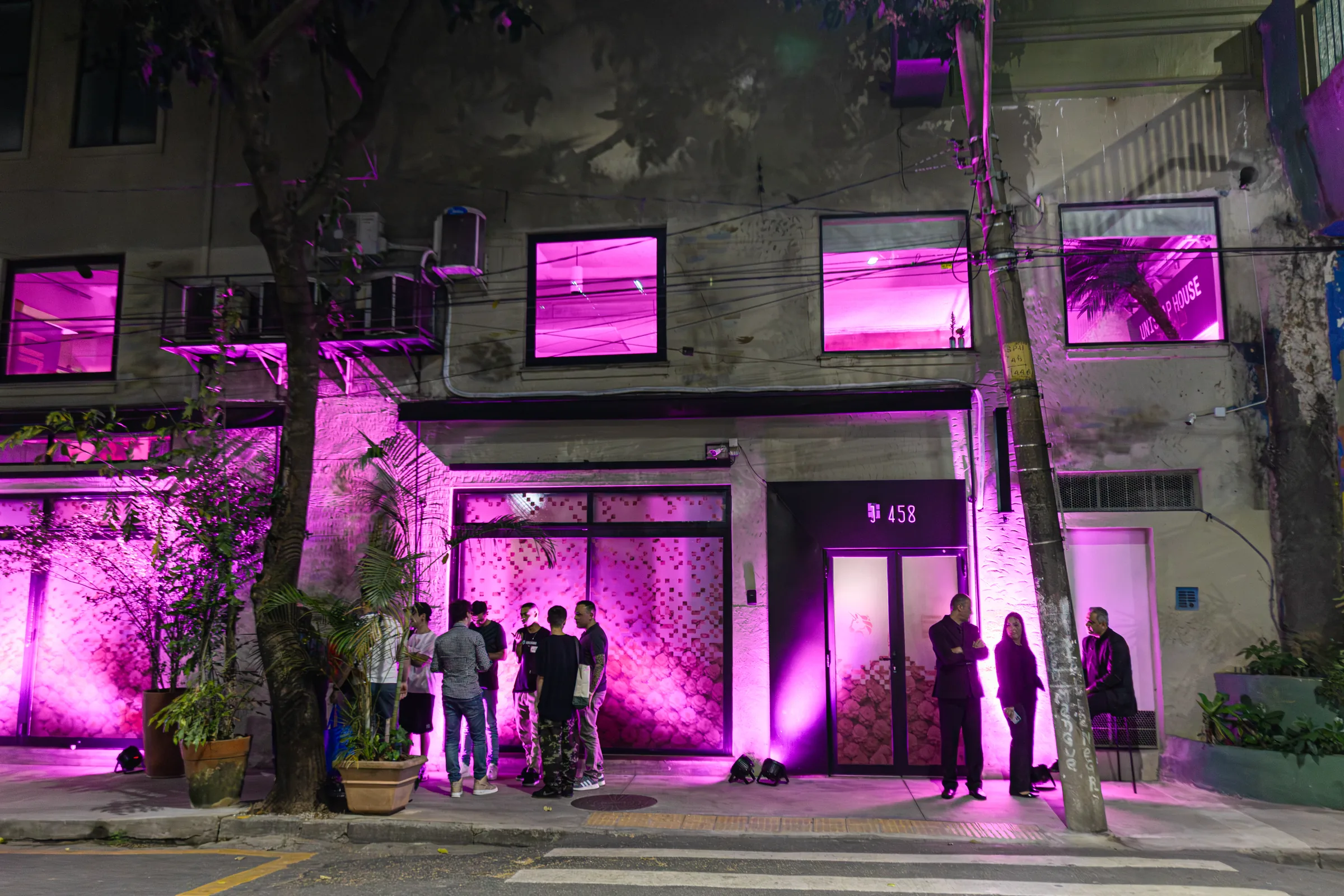
Uniswap House
One brand, four cities, four voices
As Uniswap expanded into Latin America, it needed a way to build relationships beyond the people already inside crypto. The opportunity was to bring industry leaders, banking professionals, students and advocates into the same room, creating a place for conversation, learning and exchange.
The idea was not another conference. It was a house. A temporary home for the Uniswap community where people could spend time together, meet the people shaping the industry, and experience the brand within their own city.
One house. A different character in every city.
Uniswap House became a travelling format with a local identity at every stop.
Rather than importing one global expression into Mexico City, Buenos Aires, Bogotá and São Paulo, each house began with its surroundings. Local visual culture, architecture, typography, patterns and materials became part of the identity while Uniswap remained the constant connecting them.
The system was designed to feel recognisably Uniswap without making every city look the same.
Designing with the city.
Each identity was developed around the space it occupied and the culture around it.
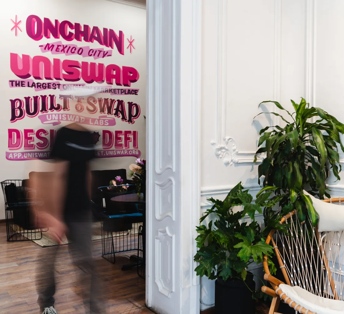
Typography, pattern, illustration and environmental graphics changed from city to city. We treated existing architecture as part of the design rather than something to cover up. Windows, walls, furniture, signage and physical details became surfaces through which the local expression of Uniswap could emerge.
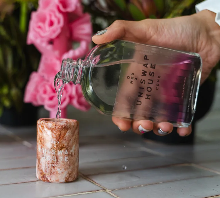
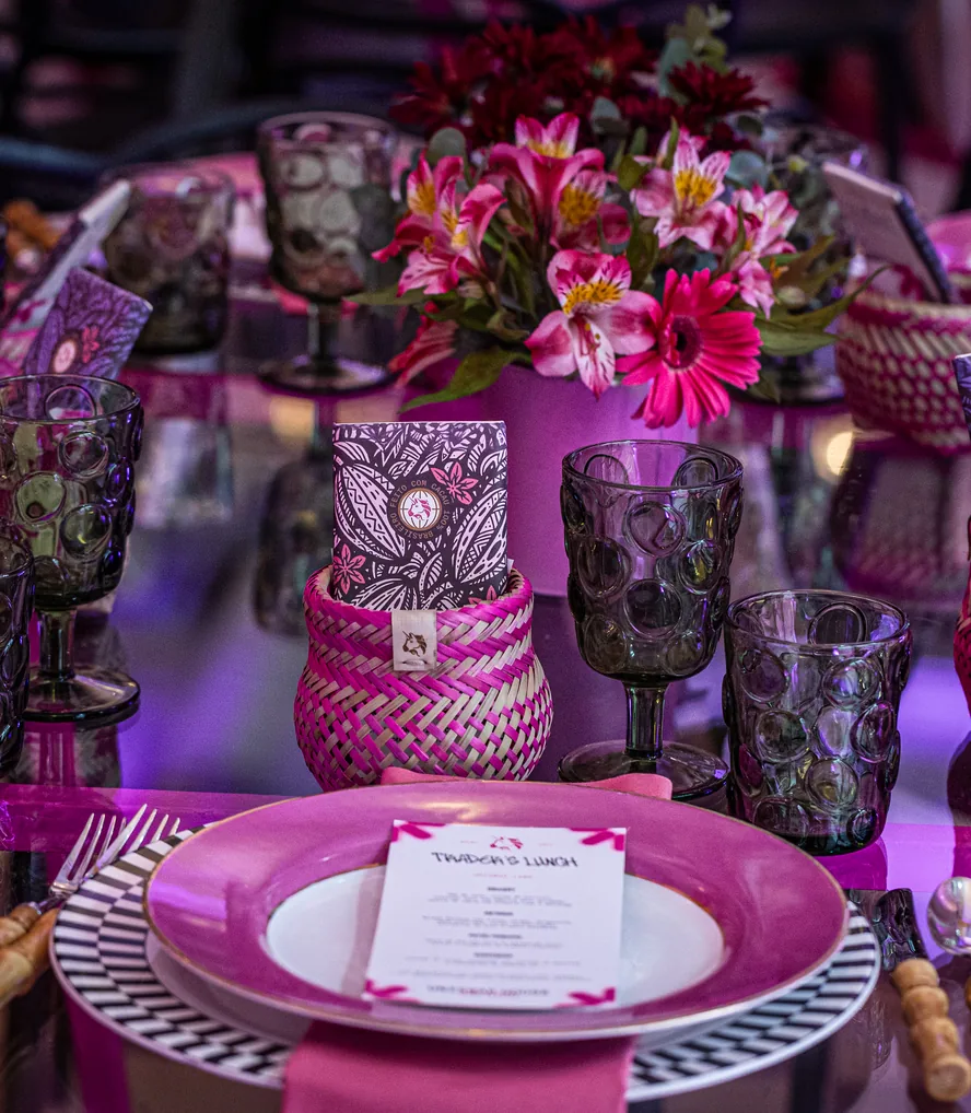
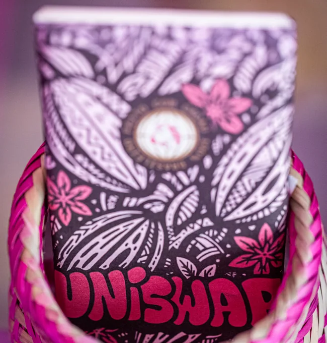
That thinking extended into the objects people took home. In Mexico, locally produced mezcal became a custom piece of the experience. In other markets, local artists, makers and products helped bring the identity into physical form.
A format that could travel without becoming generic.
The houses gave Uniswap a repeatable way to enter new markets while letting each market retain its own character.
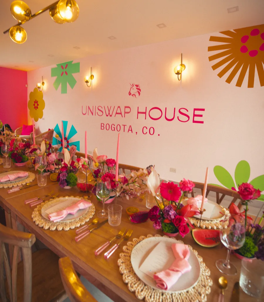
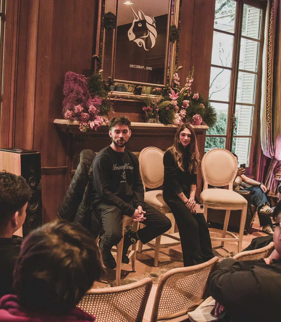
Invite-only dinners, university programming, and industry events brought different parts of the financial and crypto community together under one identity. The environments became part of the conversation around the events themselves and gave Uniswap a physical presence in markets where the brand was still building familiarity.
The result was not one event identity reproduced four times. It was a system that could shift from city to city while remaining recognisable as the same idea.
Consistency through local interpretation.
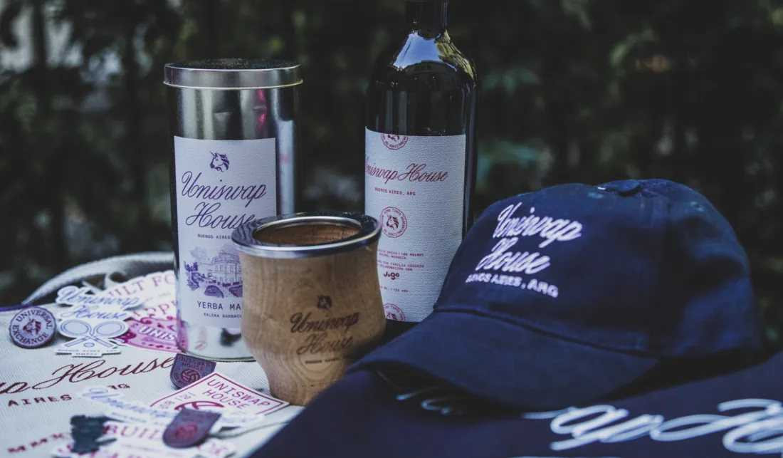
Each Uniswap House was designed as a site-specific identity, informed by the cultural context of its city. A bespoke typographic system was created for each space, using local references to shape the environment while preserving the character and authenticity of the original architecture. This typographic palette extended across wall graphics and physical touchpoints, including merch giveaways ranging from stickers and pins to curated bottles of artisanal liquor, chocolate, and coffee.
Mexico City
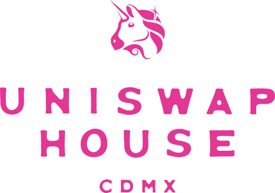
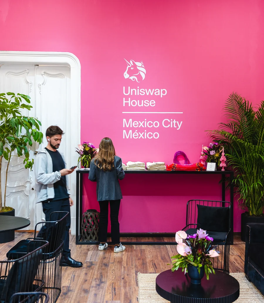
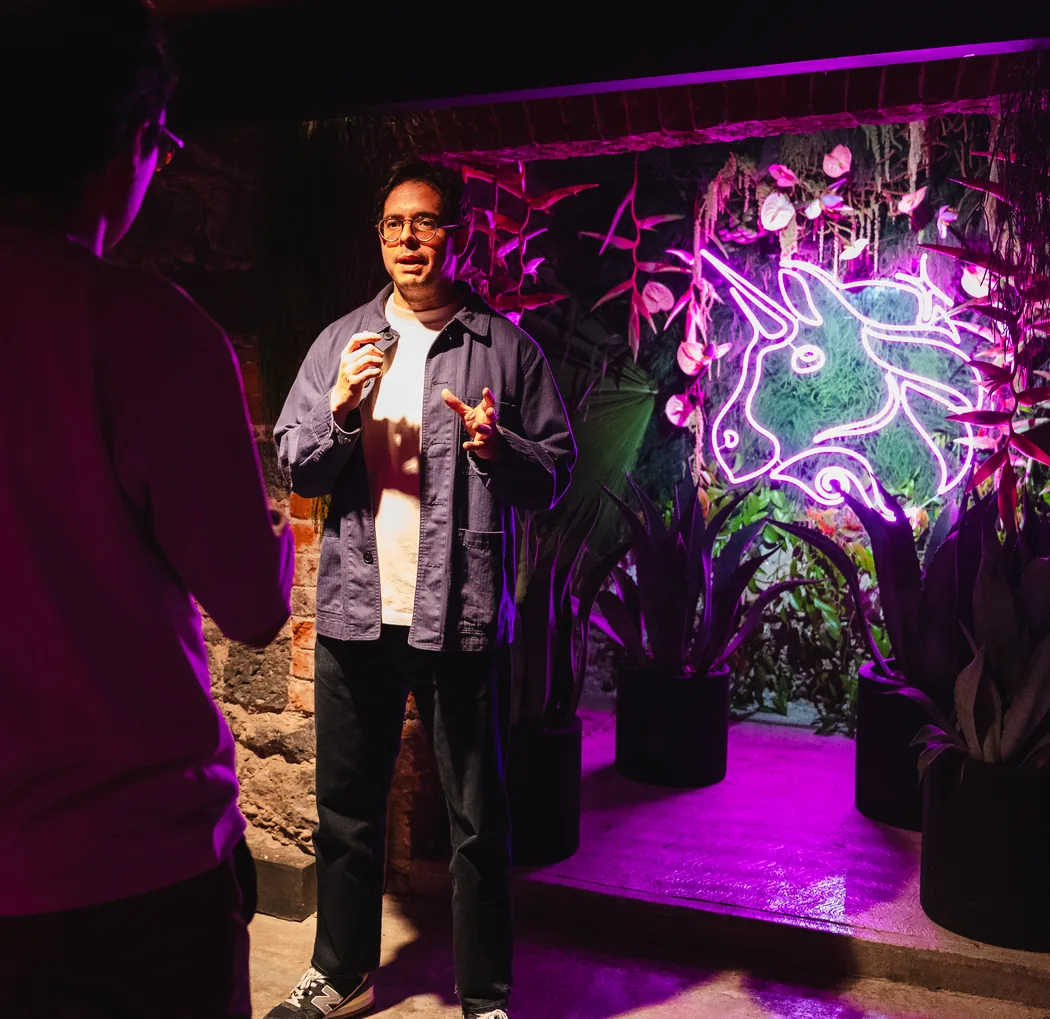
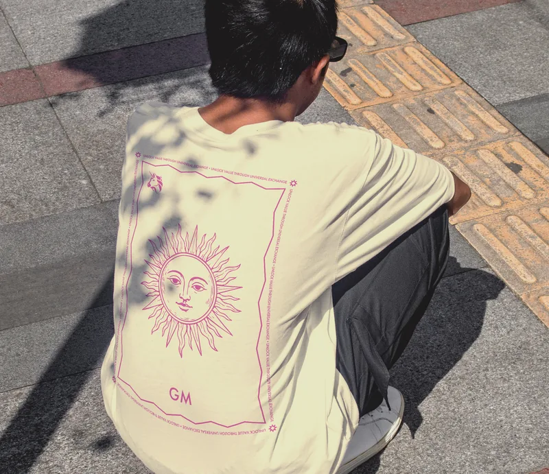
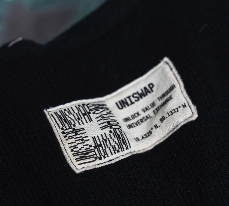
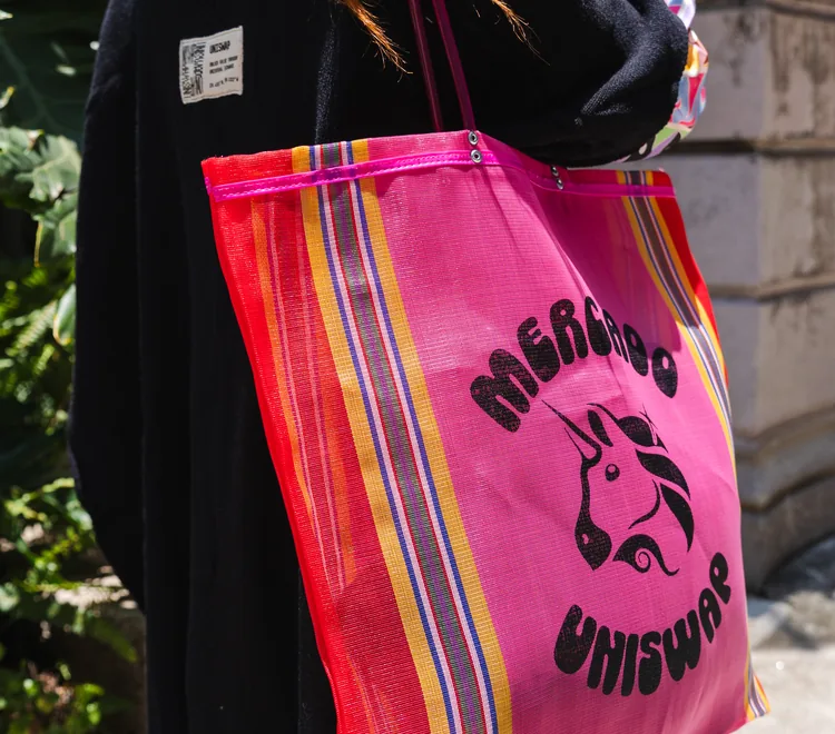
Mexico City is lettered by its markets, so its wordmark is set wide and plain and lets the city supply the ornament. The house filled in around it: a neon courtyard stage, striped mercado totes, mezcal decanted under the house mark, and a woven garment label carrying the venue's own coordinates.
Buenos Aires
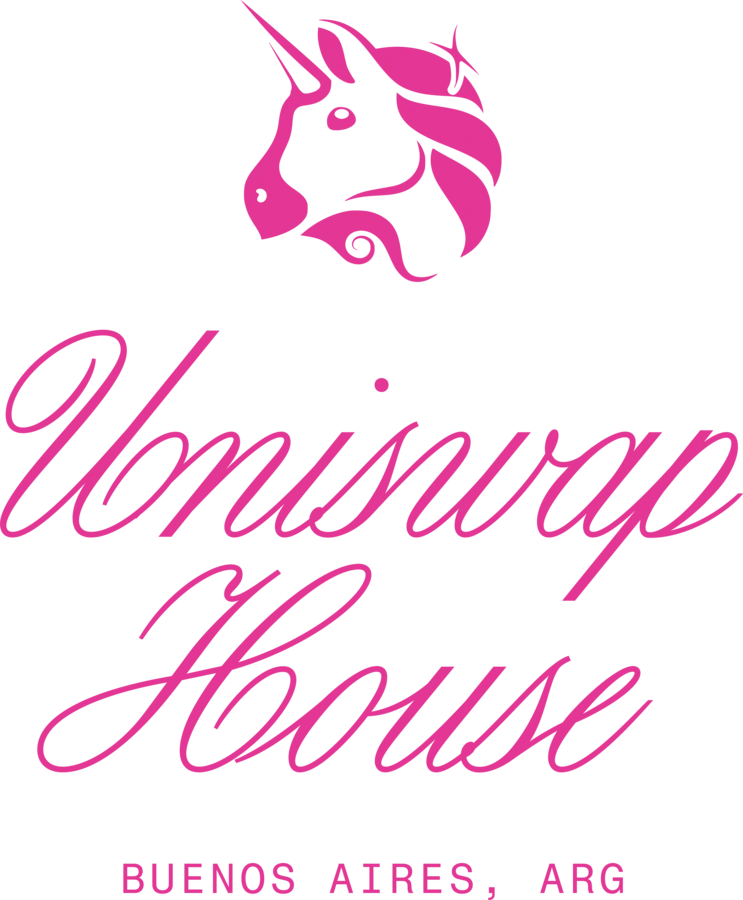
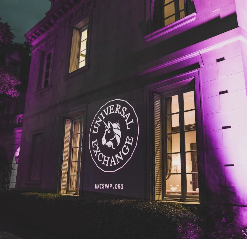
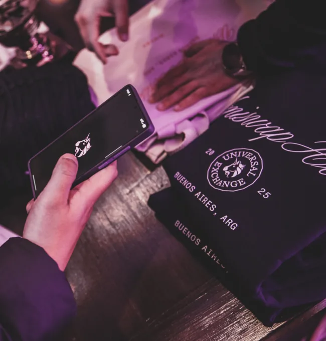
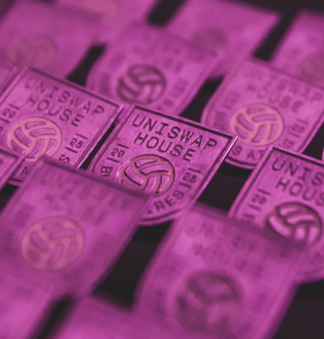
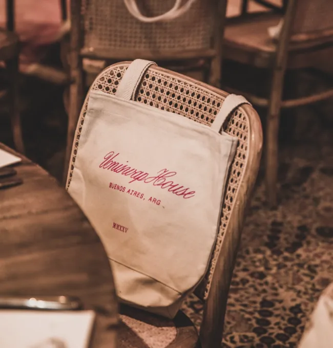
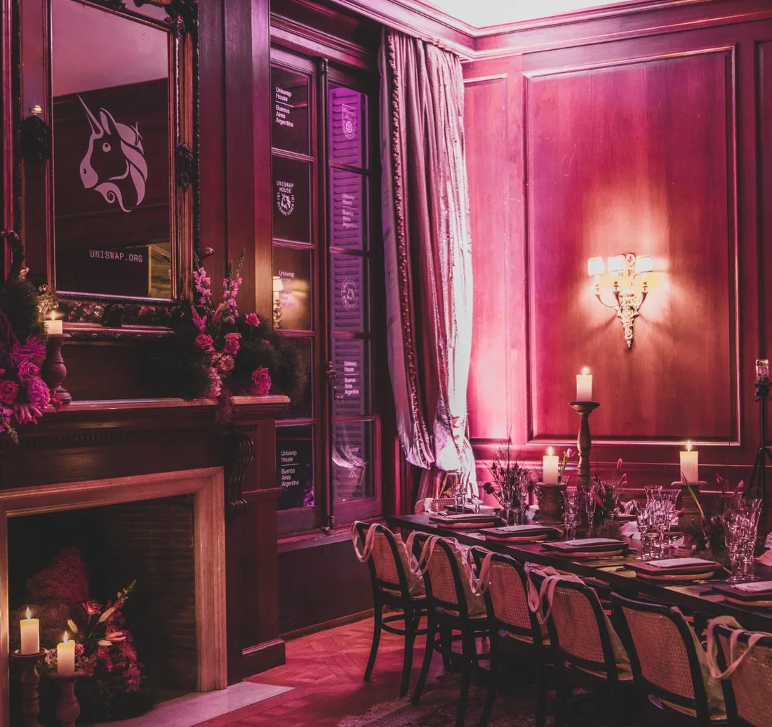
Buenos Aires answers in script, drawn the way the city letters its old shopfronts and its club crests. It ran inside a panelled mansion, so the work stayed formal and low: a crest projected across the facade at night, pins pressed like club badges, canvas carriers left on the dining chairs, and mate kit worth taking home.
São Paulo
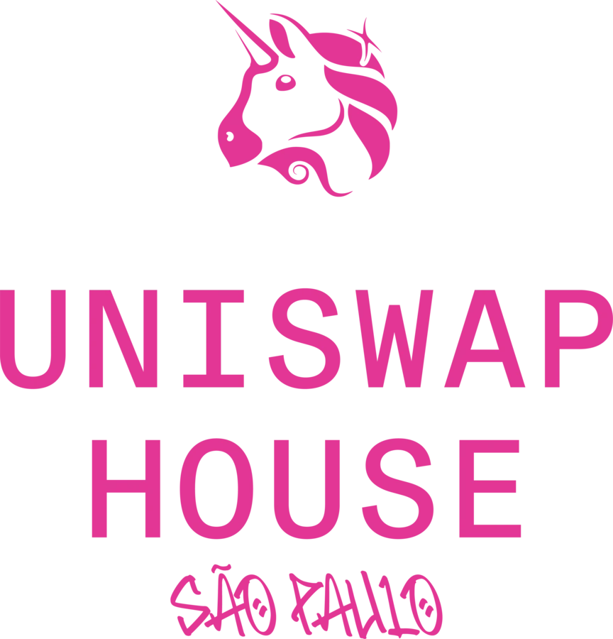
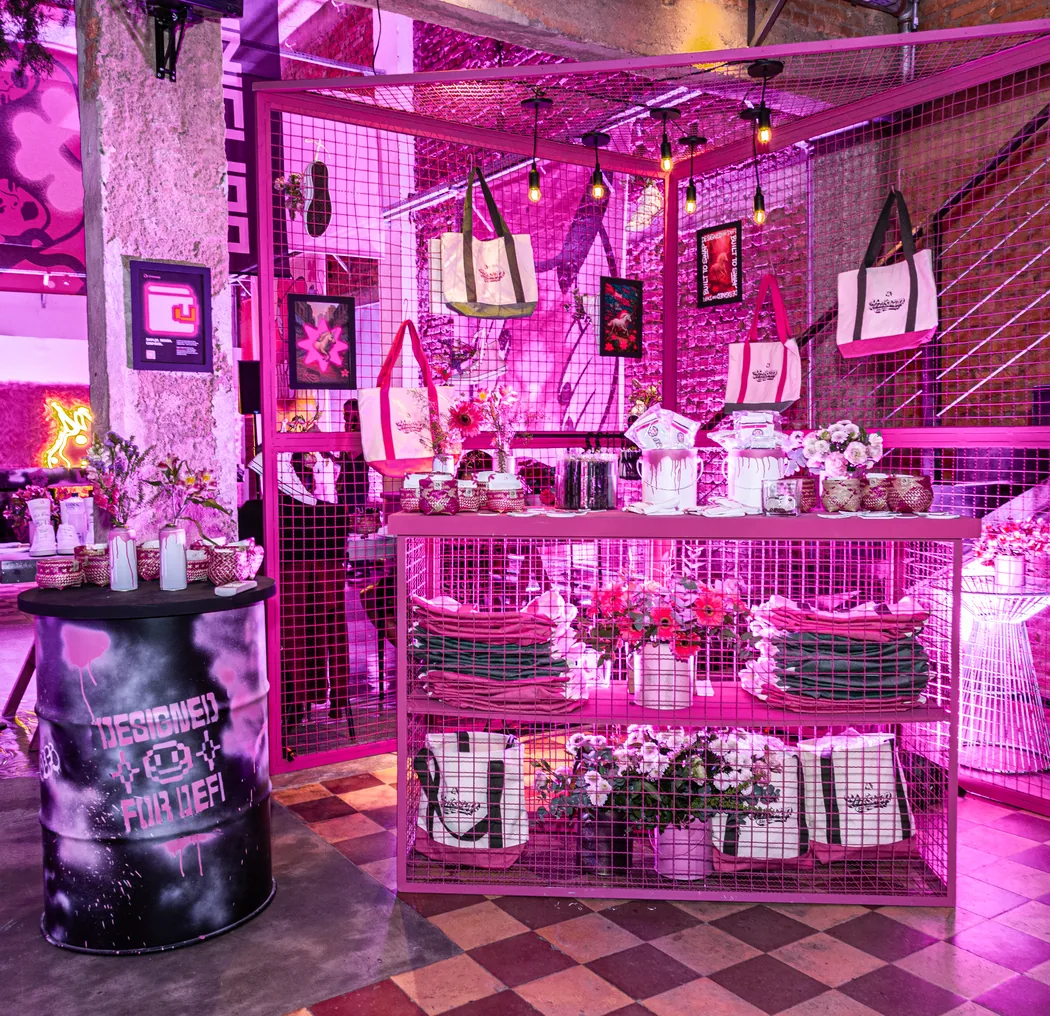
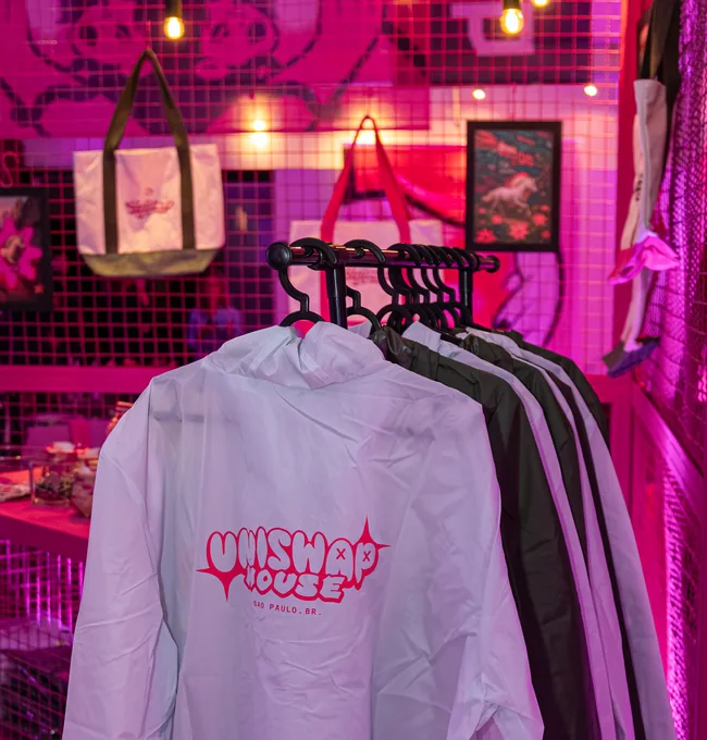
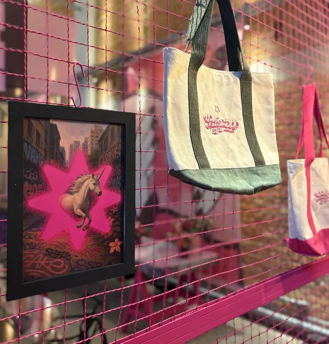
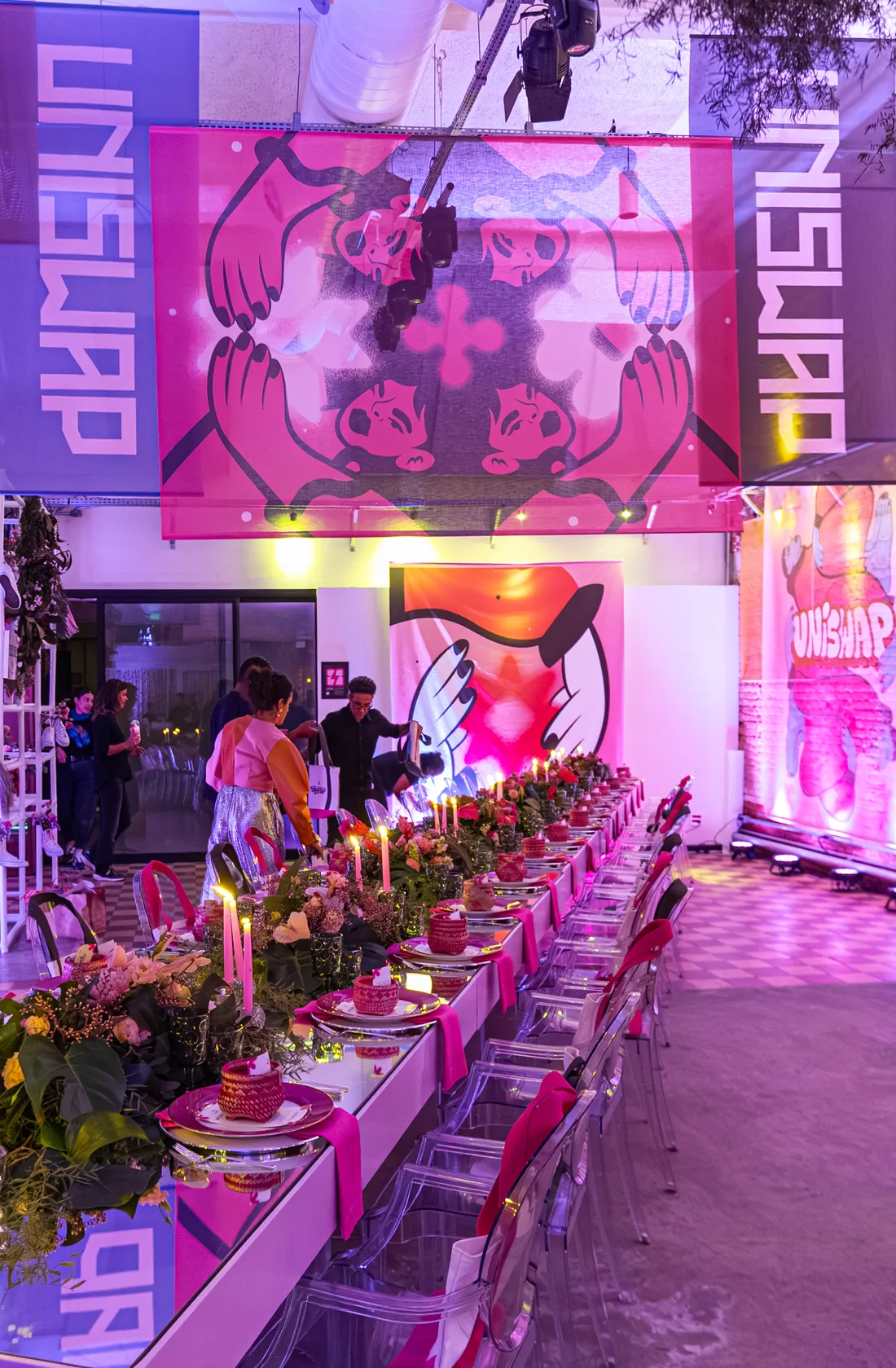
São Paulo writes its own name on the wall, so the lockup is a tag and the house was built to hold it. Pink tile, a checkerboard floor and mesh walls hung with prints and totes, with the same hand carried down onto a woodcut cup wrap and a rack of hoodies.
Bogotá
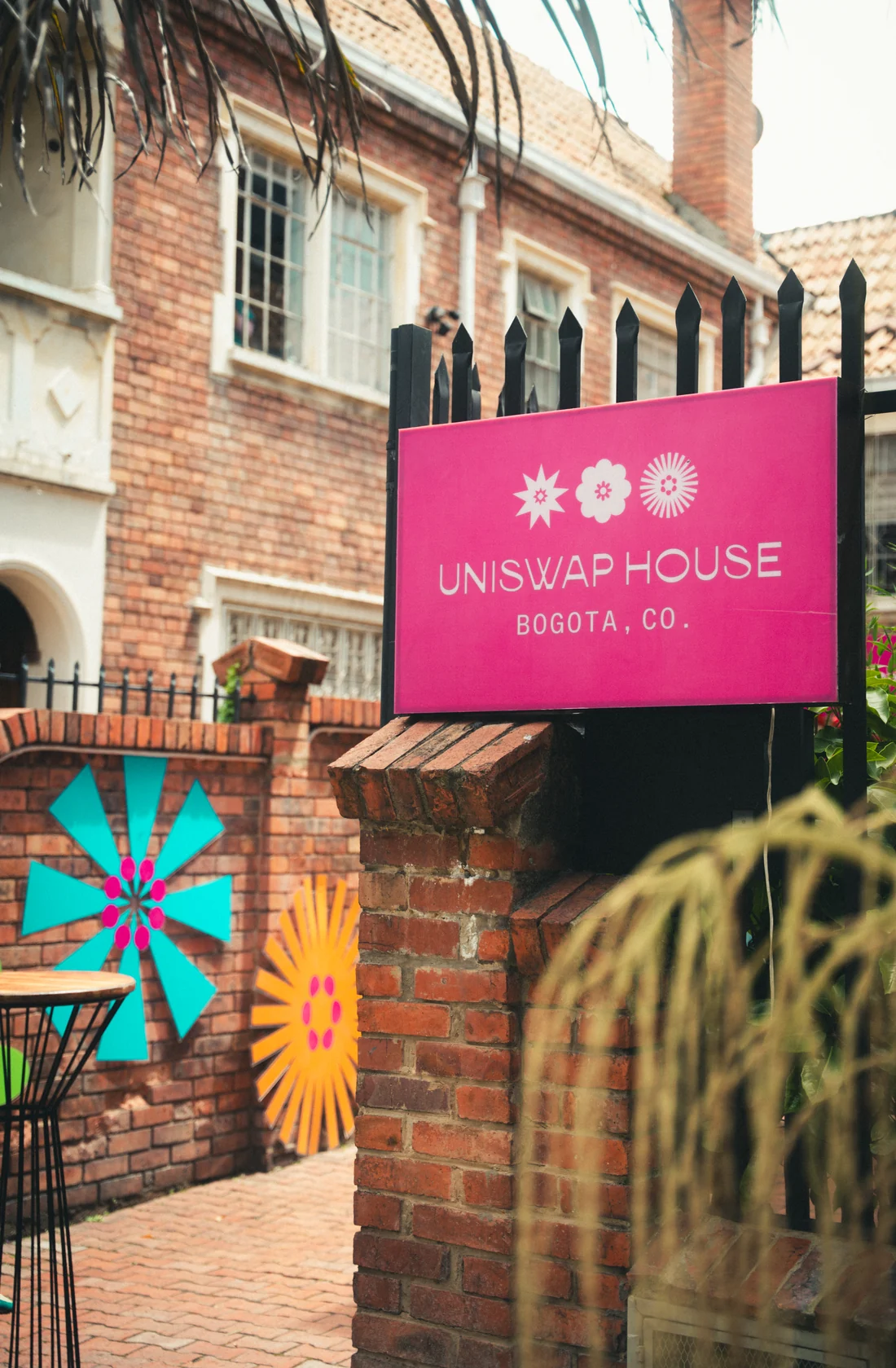
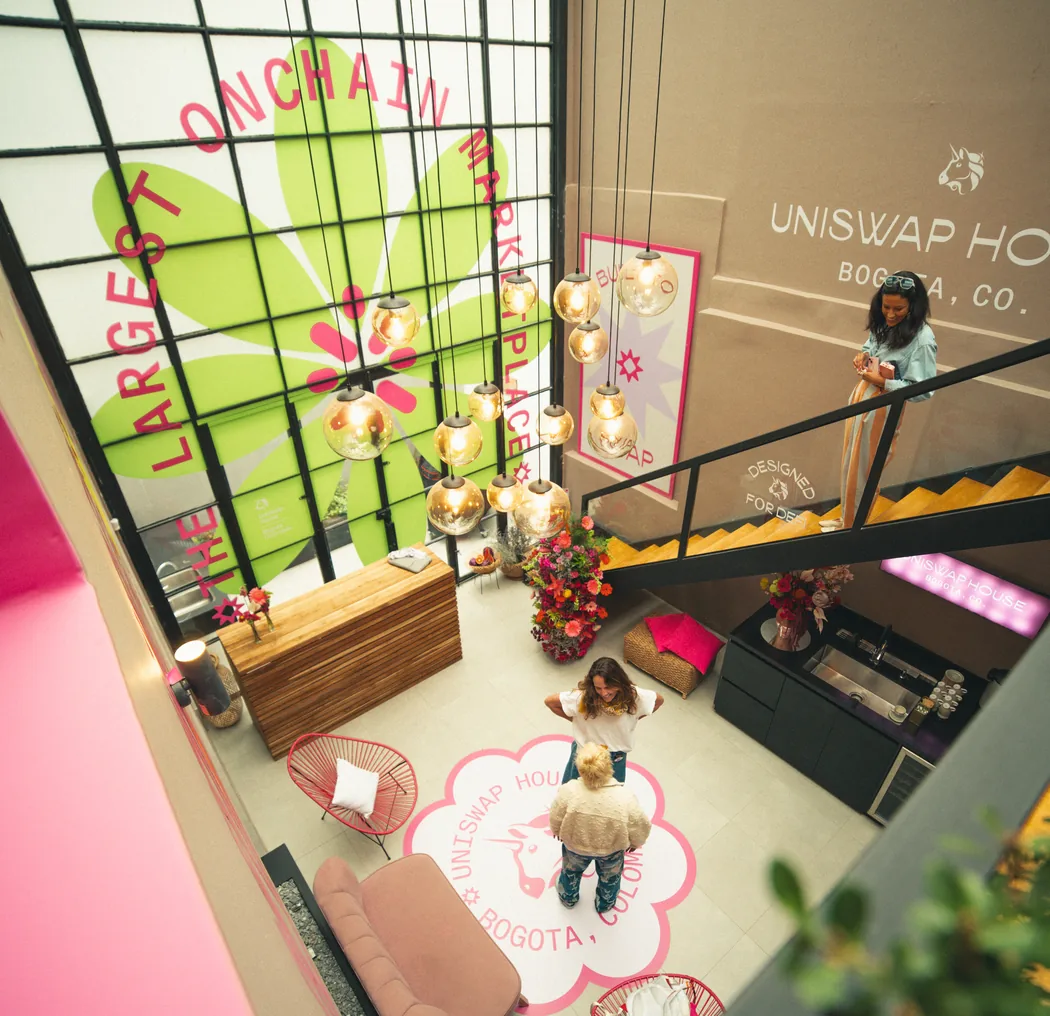
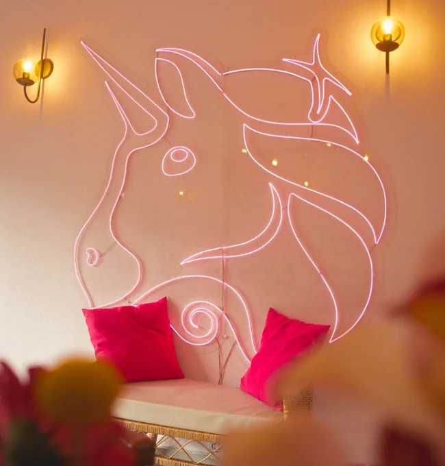
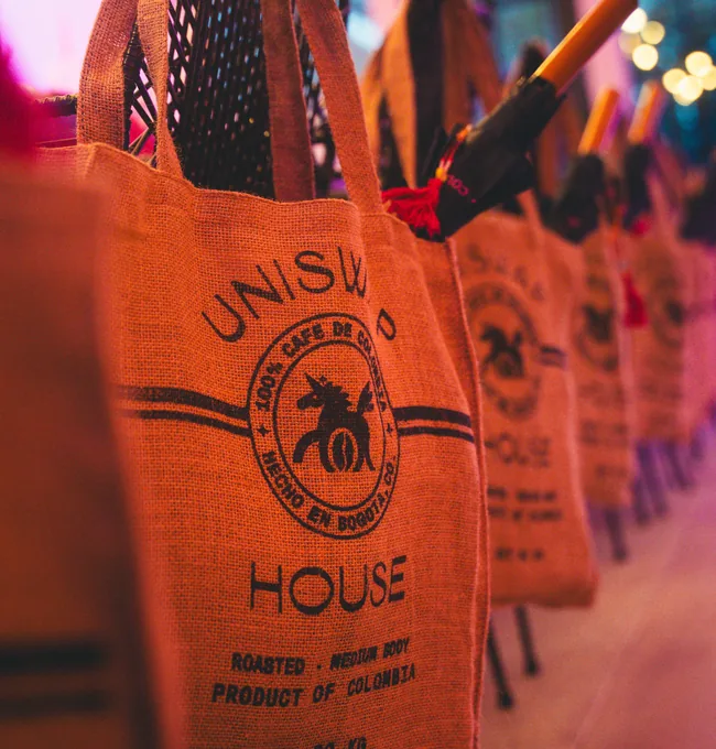
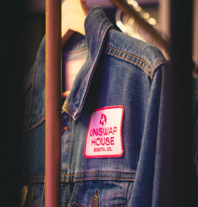
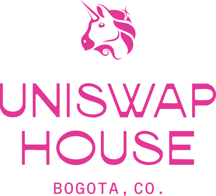
Bogotá is the daylight house. Cut-paper flowers, a white atrium and a condensed lockup that sits on a wall rather than shouts from it. The gifts are the city's own export, coffee sacks sewn into totes and a denim jacket patched the way a workwear label would do it.