Upwage
Pay transparency made personal
Upwage was created around a problem affecting millions of frontline workers.
Hourly jobs were hard to compare, wages lacked transparency, and traditional hiring platforms weren't designed around how many people actually looked for work. Founders Diana Tsai and Greg Call wanted to make better-paying opportunities easier to find while helping employers reach the people they needed.
The brand had to make that mission feel useful and human, not institutional.
Work should feel closer.
The identity began with the people Upwage was built for.
The mark became both an abstract worker in motion and a face giving a subtle wink. It brought approachability into a category usually dominated by functional job boards and corporate HR language.
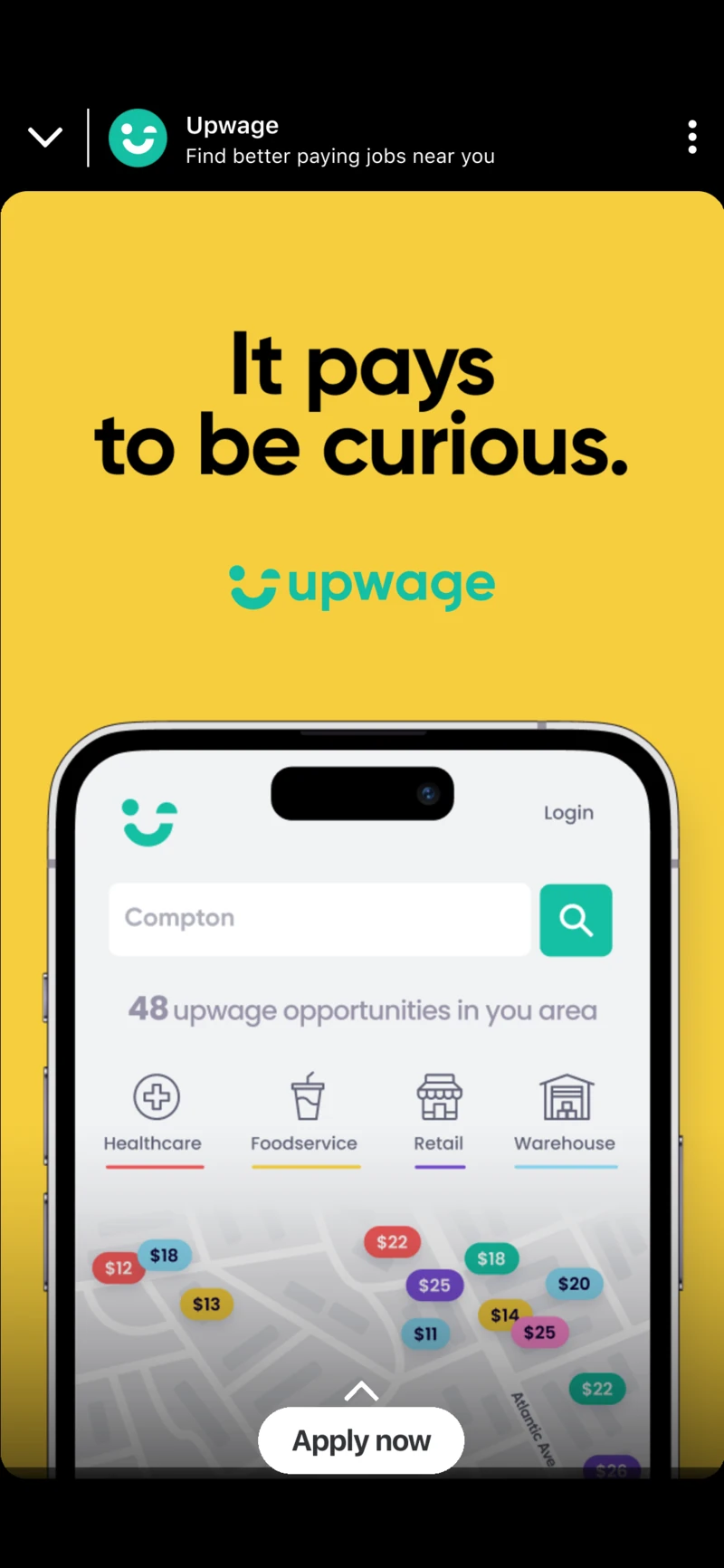
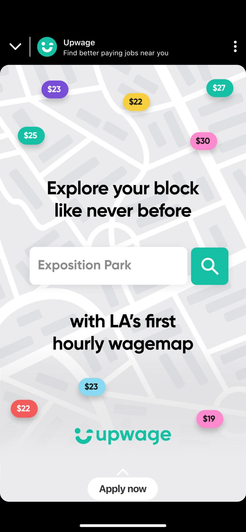
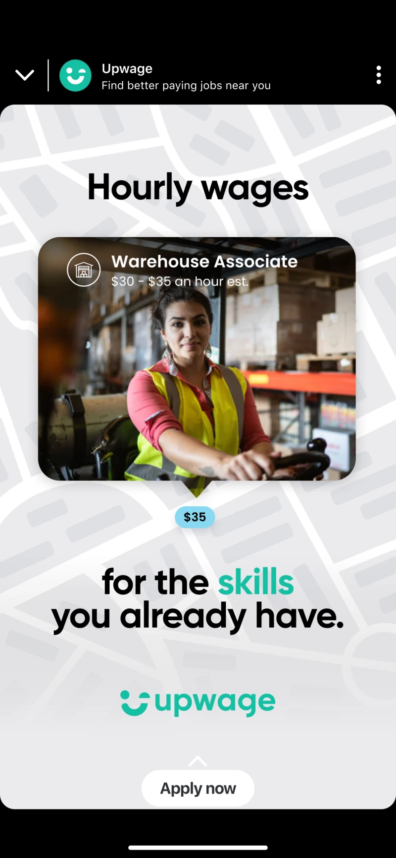
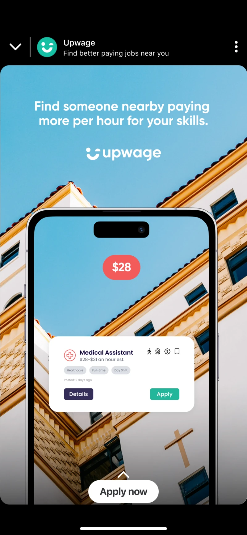
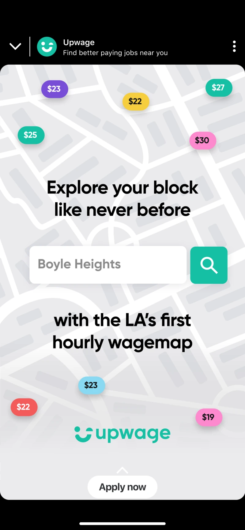
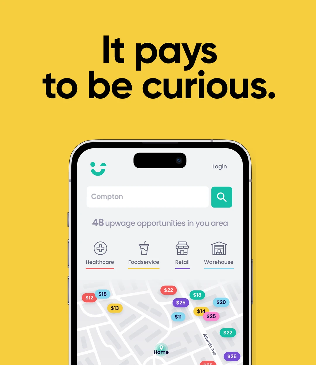
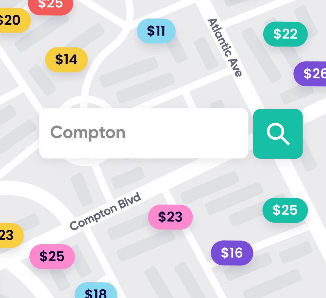
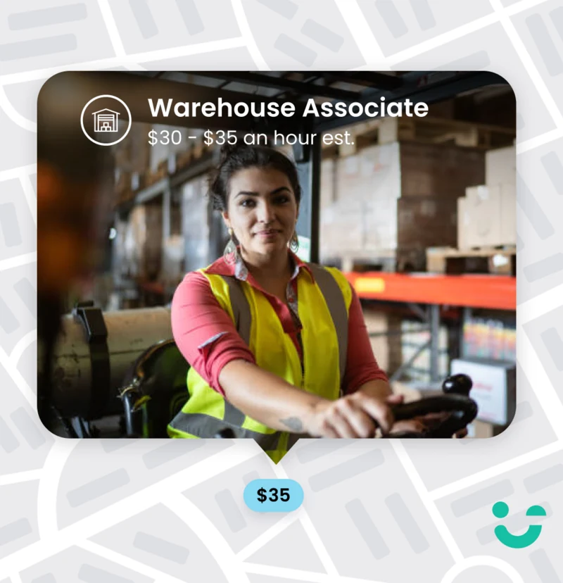
That same thinking shaped the product. The Wage Map replaced a long list of openings with a geographically driven way to discover jobs, letting people explore what was available around them and compare hourly wages more quickly.
Speaking the language of the audience.
For launch, the brand moved beyond generic technology messaging.
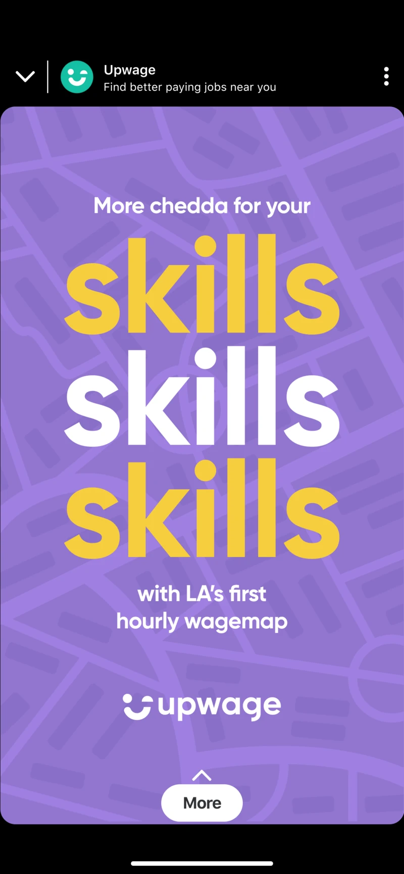
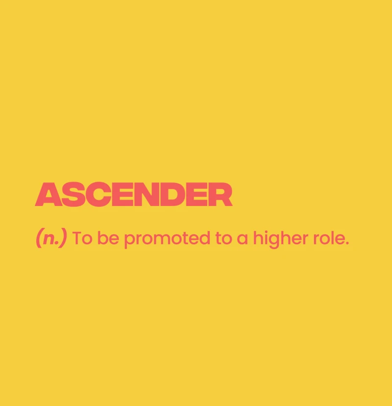
Early campaign work focused particularly on Latino and Hispanic communities in cities including Los Angeles, New York and Miami. Local expressions around work and money became part of the communication, using words such as chamba and chedda as cultural entry points rather than translating corporate copy into Spanish at the end.
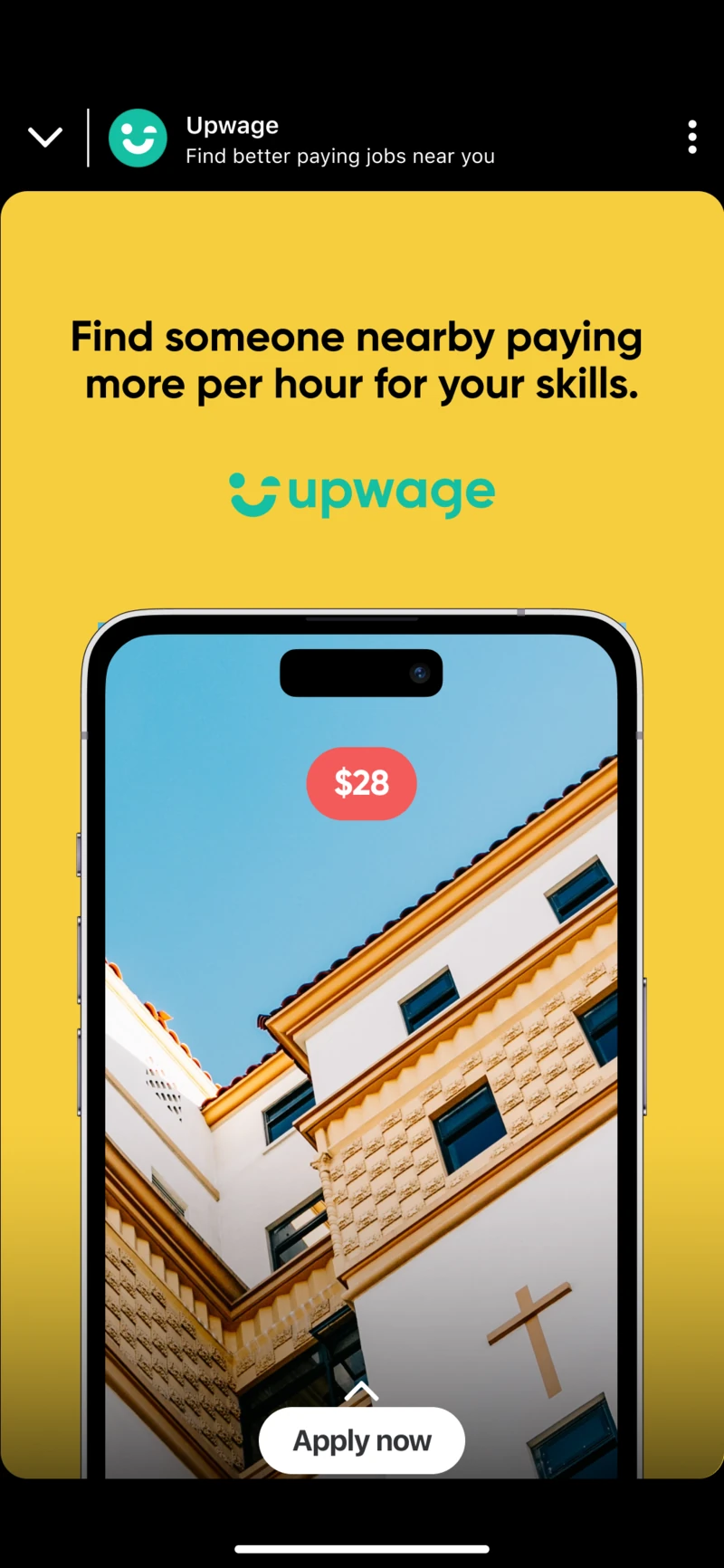
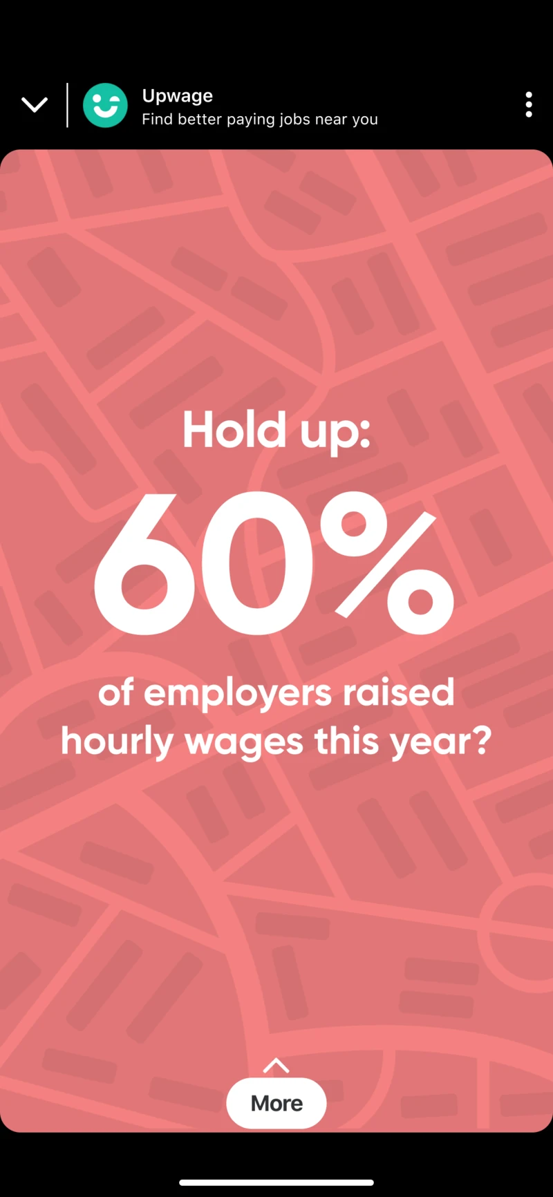
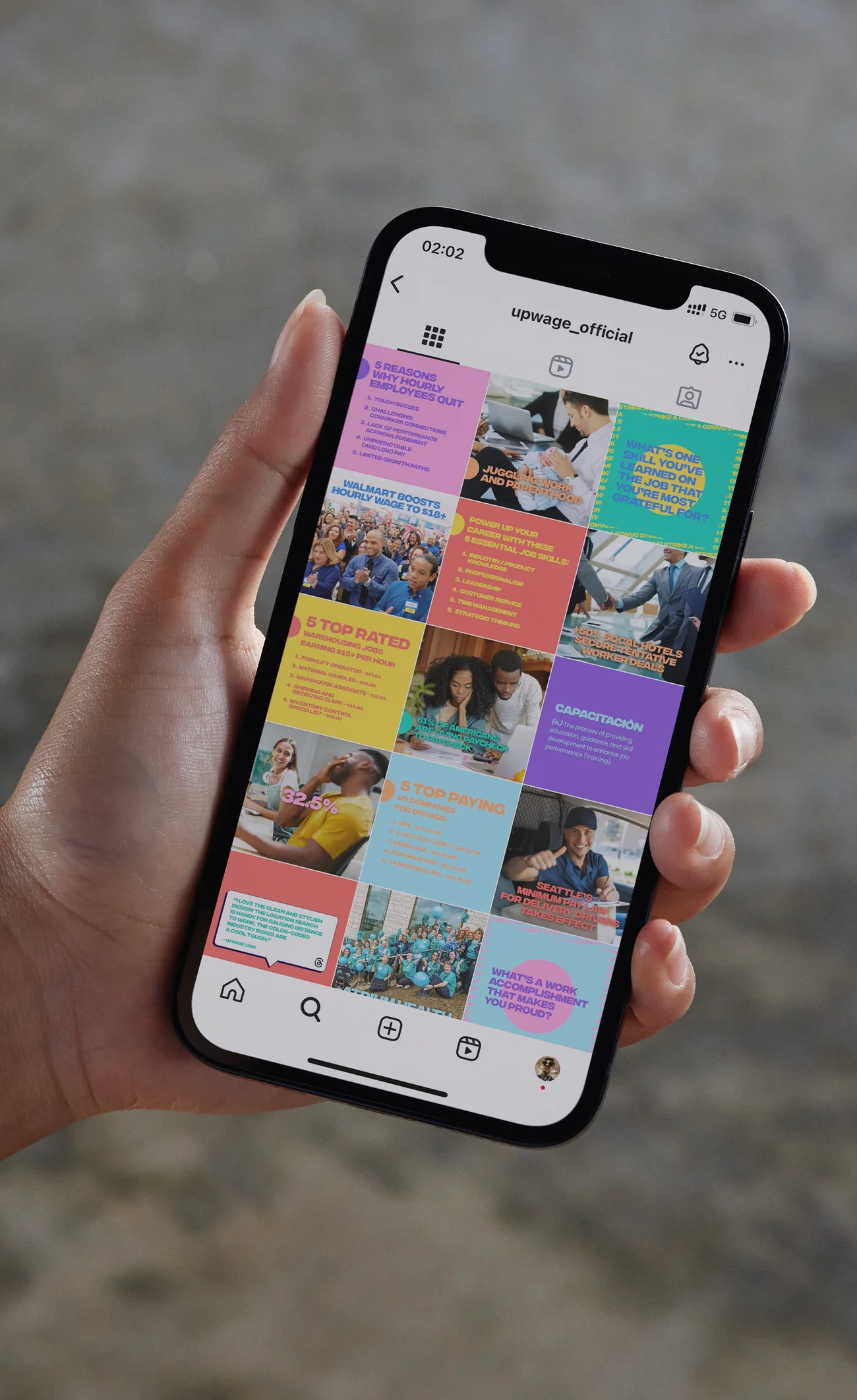
Social content turned those expressions into a broader visual and verbal system built around the culture of frontline work, pay and opportunity.
A system designed for growth.
The identity connected product, campaign and social communication around the same audience.
Upwage subsequently announced a $7.25 million seed round, bringing the company's total funding at the time to nearly $10 million.
The work gave the company a recognisable way to speak about pay transparency and better work without losing sight of the people the product was designed to serve.

Better information should feel like it belongs to you.
The identity and campaign were designed to resonate authentically with Latino and Hispanic communities in Los Angeles, using tone, language, and visual cues that reflected lived experience rather than generic tech aesthetics.